One of the great joys of professional life is being part of a high-performing team. In my experience, it’s quite amazing what a small group of talented folks can accomplish when there’s enough alignment on direction, diversity of perspectives to inform plans, talent and dedication to execute those plans, and psychological safety to work through challenges.
Yet, as many managers know, it’s damn hard to create and cultivate healthy teams. Part of the challenge is creating a sum that is greater than its parts — enough diversity of team member lived experiences to stretch what’s possible, but with enough overlap of skills to encourage collaboration and build resilience.
I like to think of high-performing team as a mosaic — up close, you see jagged pops of color, but step back and you see a beautiful design.
Built with this neat online service called Mosaically
Putting this feel-good metaphor to practical use, I’ve spent time thinking about how to visualize the composition of the team — strengths, gaps, etc. — across different measures in order to inform how to improve it.
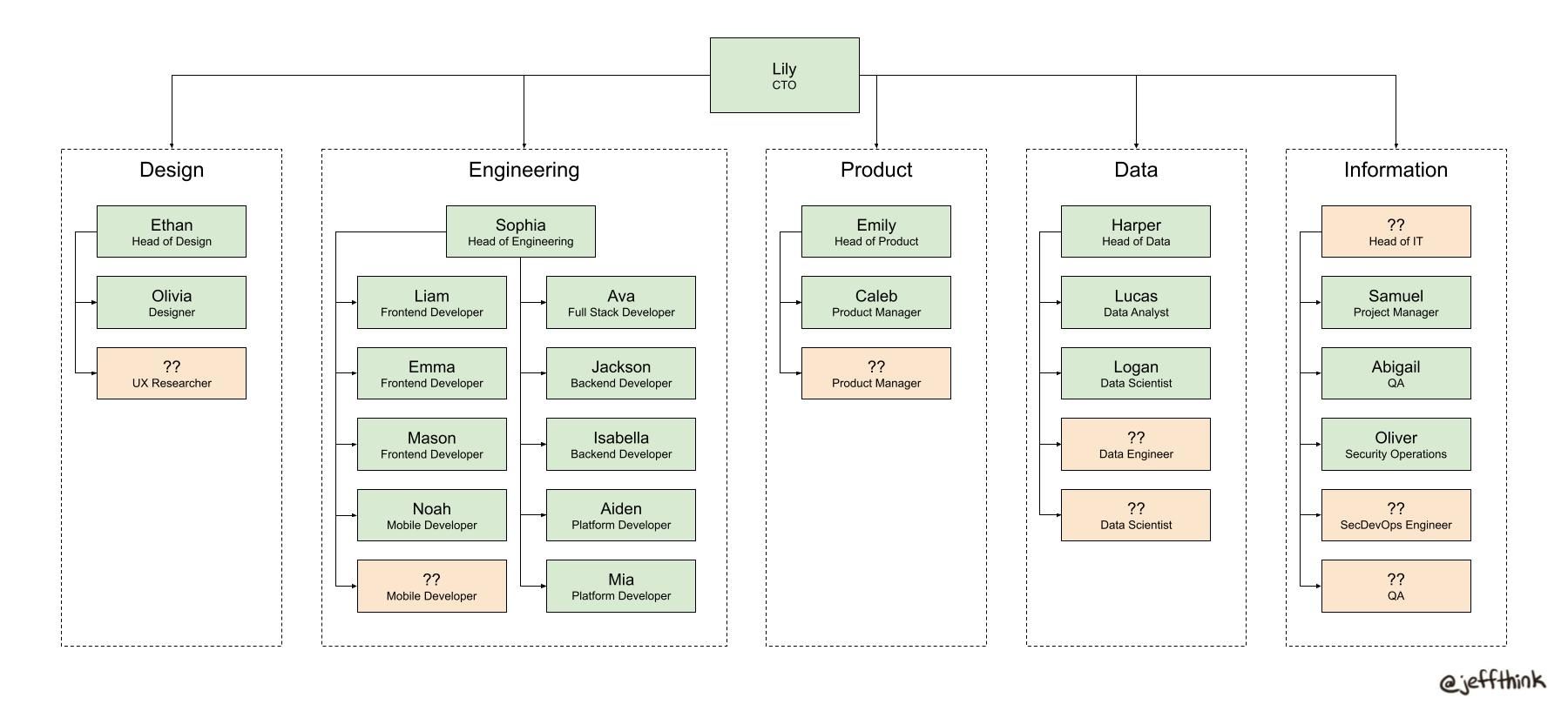
Role Coverage
The most common team visualization is the org chart, which shows job titles, manager/employee relationships, and/or team boundaries. Despite its limitations, it can be quite useful as a high-level view of structure and roles to fill. Here’s an example I created:
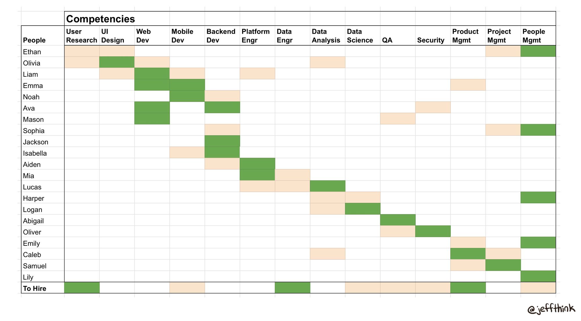
Competency Coverage
Going beyond the org chart, I’ve found it useful to map the set of competencies that a given team needs to be successful vs. those that are currently covered.
The idea here is to reinforce the “T-shaped skills” concept — each competency should be covered by at least one person with deep experience and one person with shallow experience. This ensures (a) there is a subject matter expert (SME) in that area, (b) there is at least one person with enough experience to serve as a sounding board and collaboration partner to the SME, and (c) there is a backup in case the SME is not available and/or leaves unexpectedly.
Seeing the gaps visually can be helpful for guiding hiring and/or coaching priorities. This example I created is at the technology department level, but each team could have its own view that goes a layer deeper in terms of specific skills for that discipline:
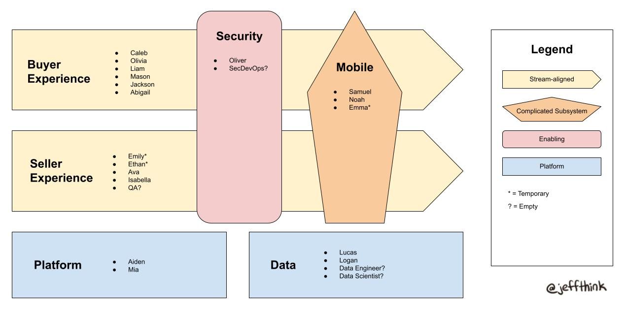
Team Coverage
Even though managers often focus their attention on individual roles & responsibilities, team health is often more likely to determine success vs. failure. Team Topologies is an org design framework that is growing in popularity because of its structured approach to building well-constructed teams. I particularly like it for visualizing (a) which teams are focused on which outcomes and (b) what are the dependencies between teams. Lack of clarity on the former and lack of awareness of the latter are two major symptoms of unsuccessful organizations. Here is an example:
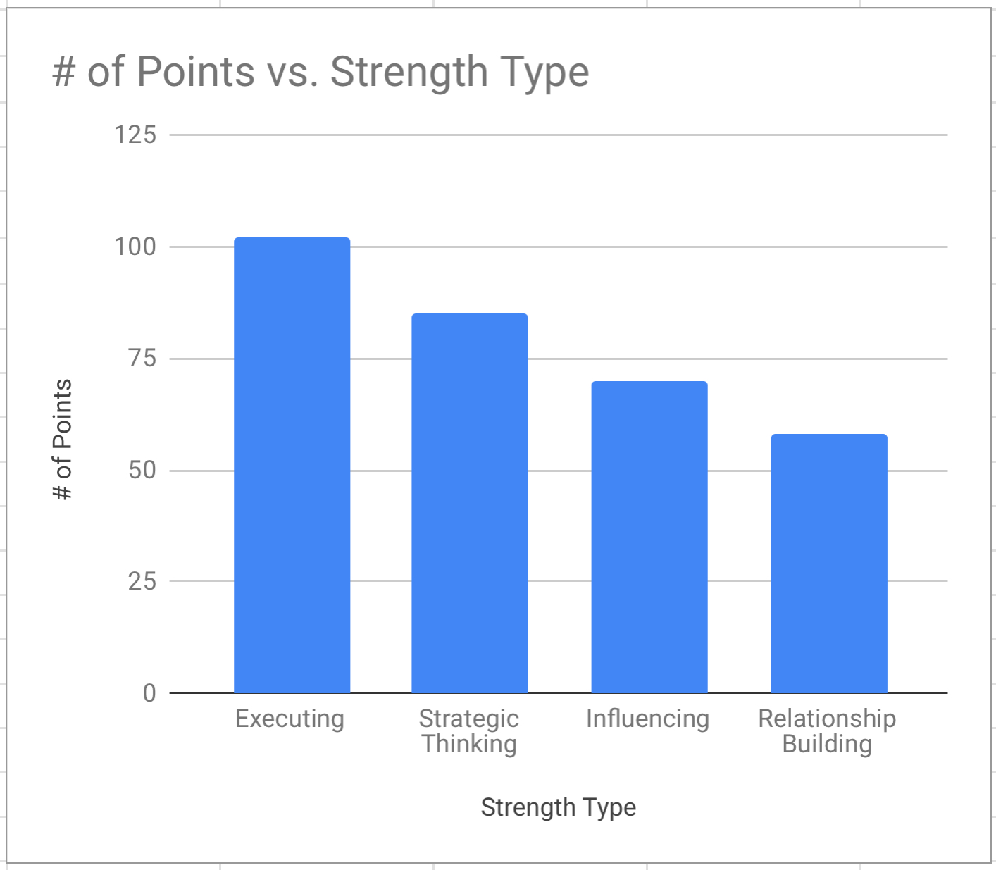
Strength Coverage
I’m moderately skeptical of personality test type exercises, but have been pleasantly surprised with my experience using CliftonStrengths. By focusing on understanding people’s strengths, it (a) stresses the importance of team gaps instead of individual gaps, and (b) helps each team member understand what gives or drains their teammates’ energy.
The example I created below mirrors a real world scenario where our team realized that we didn’t have enough coverage of relationship building and influencing strengths. This process and visualization helped us understand why we were having challenges with making cross-departmental progress on certain key initiatives, and led us to look for these strengths in upcoming interviews.
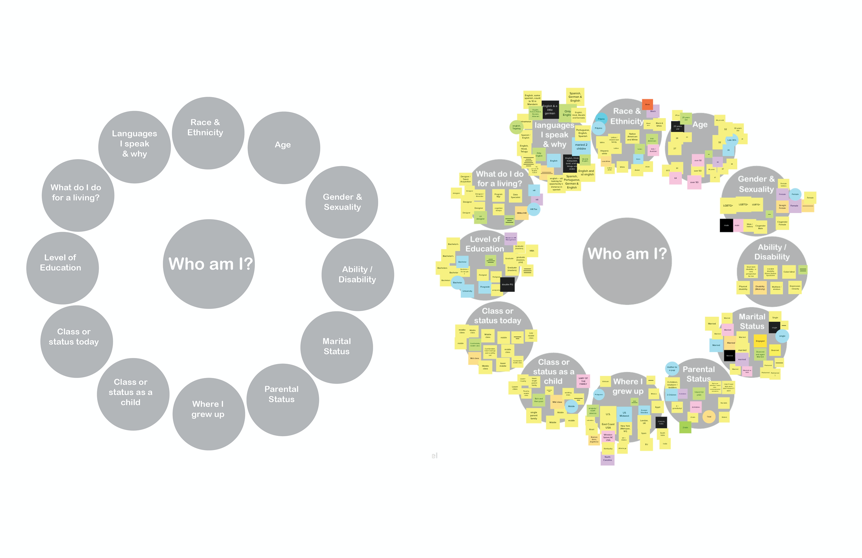
Lived Experience Coverage
As a white guy of a certain age in tech, I recognize that privilege has been a factor in my career success, and that regardless of how much I read up on Diversity and Inclusion practices, anything I share on this front should be taken with a grain of salt.
That said, I was introduced to a team exercise called the “Positionality Wheel, created by Dr. Lesley-Ann Noel, that I’ve found helpful as an exercise and visualization for understanding gaps in a team’s breadth of lived experiences without making it feel like a checkbox exercise of “Do we have someone like X on our team?”.
In Summary
Building teams is hard, and there’s no silver bullet. I hope this post inspires you to use visualizations (see all of the above examples here) as a way to assess how your team is constructed and how you might invest in improving it.

PS - This song talks about seeing more clearly AND is coupled with a video that showcases a low-performing team that becomes high performing (Cool Runnings…)!