Assessing market positioning through the eyes of your customers
There is an interesting cognitive bias known as “the curse of knowledge”, whereby someone with knowledge of a particular subject unknowingly assumes that others have the background to understand it. This phenomenon plays out all the time in life, but here I’ll focus on exploring its effect during an organization’s attempt at “market positioning” — that is, the process of establishing the image or identity of a brand or product so that consumers perceive it in a certain way. The TLDR takeaway is:
Because stakeholders in an organization are intimately familiar with their own product, they overvalue its worth and overestimate their customers’ understanding of its capabilities.
To understand why, let’s first reimagine the concept of market positioning as not just a product or marketing problem, but more broadly as a user experience (UX) problem:
How do we design and message the product in a way that best maps to the customer’s perceived view of the world?
The Foundations of User Experience (UX)
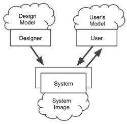
To do so, consider the UX classic, “The Design of Everyday Things” by Don Norman, which critiques the design of everyday objects — doors, pens, stovetops, etc.— in order to teach the importance of various design considerations.
“Two of the most important characteristics of good design are discoverability and understanding.” — Don Norman
One of its central lessons is that the mental model that the designer of a product constructs for “how should people use this product” is distinct from the mental model that the user employs for “how should I use this thing.” And to make matters worse, a user is often in the position of having to navigate this disconnect entirely on their own.
The Positioning Map
The way in which customers view a given product is not a dissimilar process — the product creator chooses its features, sets its price, and crafts its messaging, and through these artifacts, a customer learns to understand how the product fits into their preexisting mental model for whatever problem they’re looking to solve.
Several factors combine to make this an extremely difficult design challenge: a multitude of perplexing customers, a dynamic marketplace, a crucible of financial pressures, and the onerous task of building a great product. In order to better understand this challenge, I’ve seen many organizations leverage a tool called a Positioning Map (sometimes called a Perceptual Map):
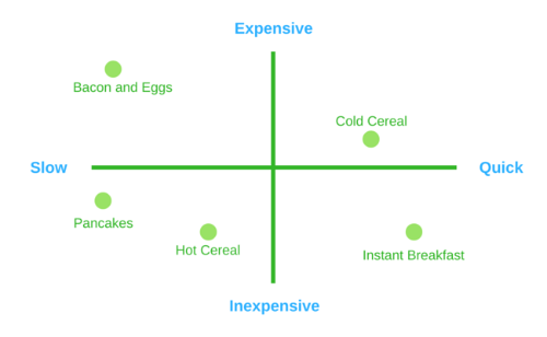
This diagram is a useful visualization technique because it allows for products to be compared against one another using their key attributes. That said, beyond the limitation of only being able to compare two properties at a time, the broader issue is that relying on it to determine market positioning can lead to faulty conclusions due to its orientation around how product creators view the market, not how customers view a product selection decision.
As Amos Tversky and Daniel Kahneman have laid out in their behavioral psychology research, people are highly susceptible to anchoring bias — that is, we rely too heavily on an initial piece of information when making decisions.
This problem can be especially pronounced when combined with another cognitive bias called the endowment effect, whereby we significantly overvalue the things we already own (or know) over things that are new.
This means that when customers are introduced to a new product, they will first search for an anchor (the closest reference point their mind already contains), and then seek — and often struggle — to understand how this new product is differentiated or more useful.
The Positioning Map does not adequately reflect this reality because it leads viewers to believe that users independently assess feature attributes in order to make product decisions. It also fails to capture the degree to which a product must be different from an alternative in order for the user to make a switch.
The Petal Diagram
In searching for alternatives to the Positioning Map, I stumbled upon a great tool called the Petal Diagram, created by the famed entrepreneur Steve Blank:
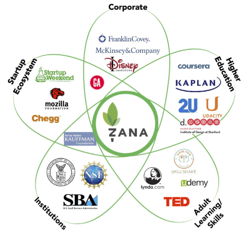
This diagram was created to describe the positioning of a company, with each petal reflecting a market that that company sees itself part of. In this way, it is a great example of describing positioning using anchor points. It is also a fun visualization for “putting your company at the center of the universe.”
Though it can be adapted to showcase products instead of companies, it still falls a bit short as a tactical tool since it doesn’t allow for enough granularity to assess how closely a specific company or product is positioned relative to each petal (i.e. anchor). In the example above, an important but difficult question to answer is this: “Is Zana more easily associated with startups or large corporations in the eyes of its potential users?”
Customer Lens Diagram
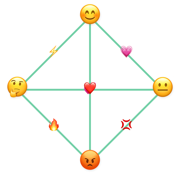
Over the years, I’ve created variations to the tools above and have landed on a version that I call the Customer Lens Diagram because I’ve always been tickled by the fantastical idea of being able to see the world through someone else’s eyes by wearing their glasses. This visualization combines the anchor-oriented Petal Diagram and the comparison-oriented Positioning Map:
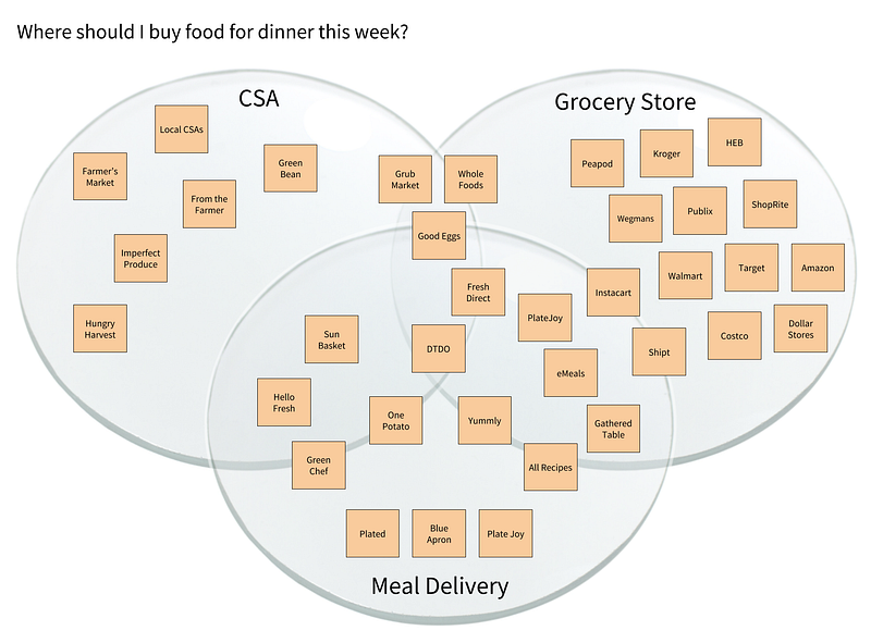
The problem statement defines the intent of the customer in evaluating the products in the market, and each circle highlights a particular lens on how that customer loosely groups those products. It is humbling (and frustrating) to evaluate your product this way because it forces you to assess it through their eyes. In doing so, you realize that many customers don’t view the market — including your product — the way you think they should.
This discomforting realization is a good thing because it allows you to be proactive in problem-solving an anchor-based approach for reaching that customer. For example, the deeper into a given lens a product is positioned, the easier it is for the customer to understand it because it clearly matches preconceived reference points. But for the same reason, it could also make it more difficult for that product (especially if it’s new) to stand out amongst others in that lens.
Conversely, products that are positioned at the intersection of lenses have more potential to stand out, but can be more difficult for customers to understand because of a muddier connection to their existing reference points. I find products that intersect more than two lenses particularly fascinating because there is both an amazing amount of potential in building a product that solves the customer’s problem by interweaving different types of solutions, but also an amazing amount of risk of confusing the customer — whether through convoluted messaging or an incoherent set of product features.
Key Questions
When I’m discussing market positioning using the Customer Lens diagram, I ask the following questions:
- What are the lenses our customers use in this market? How do we know?
- Where are we honestly positioned right now? Where would we like to be?
- What do we need to believe for us to think this new positioning can work?
- Does our current feature-set support this new positioning?
- How can we message this new positioning concisely and authentically?
One last question that deserves special mention is:
What lens from another market could we potentially connect to the user’s problem?
For example, at Door to Door Organics (DTDO), we built an alpha product that we pitched as “Stitch Fix for Groceries.” It proved both understandable and intriguing to our core demographic since it connected their clothing subscription market lens to their online grocery shopping problem. It shouldn’t be surprising that this technique is quite popular among startups looking to enter new markets with familiar approaches.
Ultimately, we better understand our product’s positioning by making hypotheses and testing them. As such, these types of diagrams are best used as a way to a) develop a hypothesis to test and b) communicate findings. I hope that you find the Customer Lens diagram useful in that regard, and I’d love to hear of other tools you like that serve a similar purpose!